How I style


The alchemy of styling rests upon a few simple principles. Their combination allows for endless possibilities to compose a striking picture.
These are just a few guiding principles that help me evaluate decisions while composing a picture for the camera. These principles are also meant to be refined through practice. I often start photographing with ideas forming, and come back to the photographs to re-assess what works and what needs adjustments.
Here are a few to begin with!
Selecting PROPS
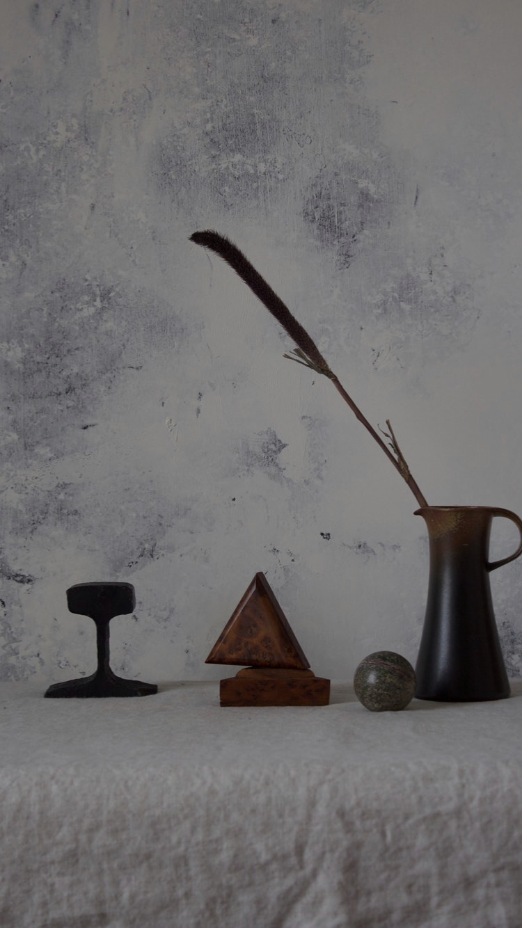
One can reduce every shape imaginable to these forms: triangle, circle, and square (or rectangle). Using all or several of these shapes helps keep the eye engaged. This is especially helpful when selecting props or objects to be photographed.
Looking at their relative size in relationship to one another is also vital, because it helps prioritize our visual focus.
Contrasting opposites
Placing a clutter of objects in one area, and letting the rest of the image “breathe”.
Contrasting dark objects against a light background, and occasionally pulling in mid-tones for less bold of a contrast.
A successful balance of lines and arabesques.
A COMMON THREAD
Too much contrast everywhere can drain the eye from a sense of clarity of what we’re looking at. It helps to establish a few “themes” that visually look grouped or similar.
For example, keeping a limited color palette to focus on different shapes. Or choosing many different objects against a simpler background.
